
Content

Most companies do not lack data visualization. In fact, they suffer from “dashboard fatigue.” Business users are overwhelmed by hundreds of disconnected Power BI reports, often showing conflicting numbers for the exact same metric.
This chaos happens because teams treat Business Intelligence as a front-end design task. They focus on making pretty charts rather than building a solid back-end structure. The result is a system that looks good on the surface but cannot be trusted for making million-dollar decisions.
Modern Power BI initiatives fail when the underlying architecture does not support repeatable, high-quality analysis. Effective architecture treats Power BI as a comprehensive decision system. It sits on top of governed semantic models, structured data pipelines, and operational workflows.
This guide outlines how IT and BI leaders must design Power BI solutions that are scalable, governed, and tightly coupled to actual business decisions, rather than just acting as a collection of ad-hoc reports.
Why Do Beautiful Dashboards Fail to Drive Decisions?
They fail because they are built as isolated visual projects, lacking a governed, high-performance data architecture underneath them.
When an executive opens a report and it takes 15 seconds to load, they lose patience. When the “Total Revenue” number on the marketing dashboard does not match the “Total Revenue” on the finance dashboard, they lose trust. Once trust is gone, the user abandons the tool and goes back to asking analysts for manual Excel extracts.
A dashboard is simply the thin user interface sitting on top of a massive data structure. If you do not engineer the foundation correctly, the visuals do not matter. A true decision system guarantees consistent metrics, explainable logic, and reliable refresh rates.
Workspaces vs. Apps – How Do You Organize Power BI for the Enterprise?
You organize Power BI by keeping all development work hidden inside Workspaces and distributing the final, read-only reports to executives through packaged Power BI Apps.
The most common mistake companies make is sharing direct links to Workspaces with their business users.
- Workspaces (The Workshop): This is where data engineers and analysts build, test, and break things. It is a collaborative environment meant only for creators. It is full of draft reports and raw datasets.
- Power BI Apps (The Showroom): This is the curated experience for the decision-maker. An App bundles multiple reports and dashboards into a single, professional navigation menu. It is read-only, preventing accidental changes, and provides a clean, governed environment.
By strictly separating the workshop from the showroom, you prevent confusion and protect the integrity of your final reports.
Are your Power BI dashboards slow and untrusted?
Stop building isolated visuals and start architecting decisions. Our experts design scalable semantic models and build high-performance Power BI environments you can trust.
Build a reliable data foundation.

Build a reliable data foundation.
What Are the Four Architectural Layers of a BI Dashboard Decision System?
A scalable Power BI environment requires strict separation between data ingestion, semantic modeling, security governance, and the final visual interface.
If you want your platform to perform well at an enterprise scale, you must architect it in these four distinct layers:
1. Ingestion and Transformation (Pushing ETL Upstream)
Heavy data cleaning should never happen in Power Query inside the individual report. If you force Power BI to do massive transformations every time it refreshes, your reports will be slow and prone to failure under load. Instead, push the heavy lifting upstream to your data warehouse or data lake (like Microsoft Fabric or Azure). Feed Power BI clean, curated tables.
2. The Semantic Model (The Heart of the System)
The semantic model is where you store your relationships and business logic. The absolute standard for Power BI is the Star Schema. Flat, wide tables ruin performance and complicate DAX calculations.
For large organizations, we use Multi-layered Semantic Models:
- Core Layer: Centralized, certified enterprise KPIs (e.g., Official Revenue).
- Departmental Layer: Specific logic added for individual teams.
- Consumption Layer: Thin, highly optimized models built for specific dashboards.
3. Security and Governance (Building Trust)
Governance transforms a dashboard from an isolated file into a trusted system. You must implement Row-Level Security (RLS) so users only see the data they are authorized to view. Furthermore, use the “Certified Dataset” badge. Executives need to see a physical checkmark proving the data model is tested and verified by IT.
4. The Consumption UI (F-Pattern Design)
The top layer is the visual experience. Keep it simple. Good dashboard design uses the “F-Pattern.” Place your highest-level KPIs at the top left, add trend context in the middle, and place granular, detailed tables at the bottom. This matches how users naturally scan a screen.
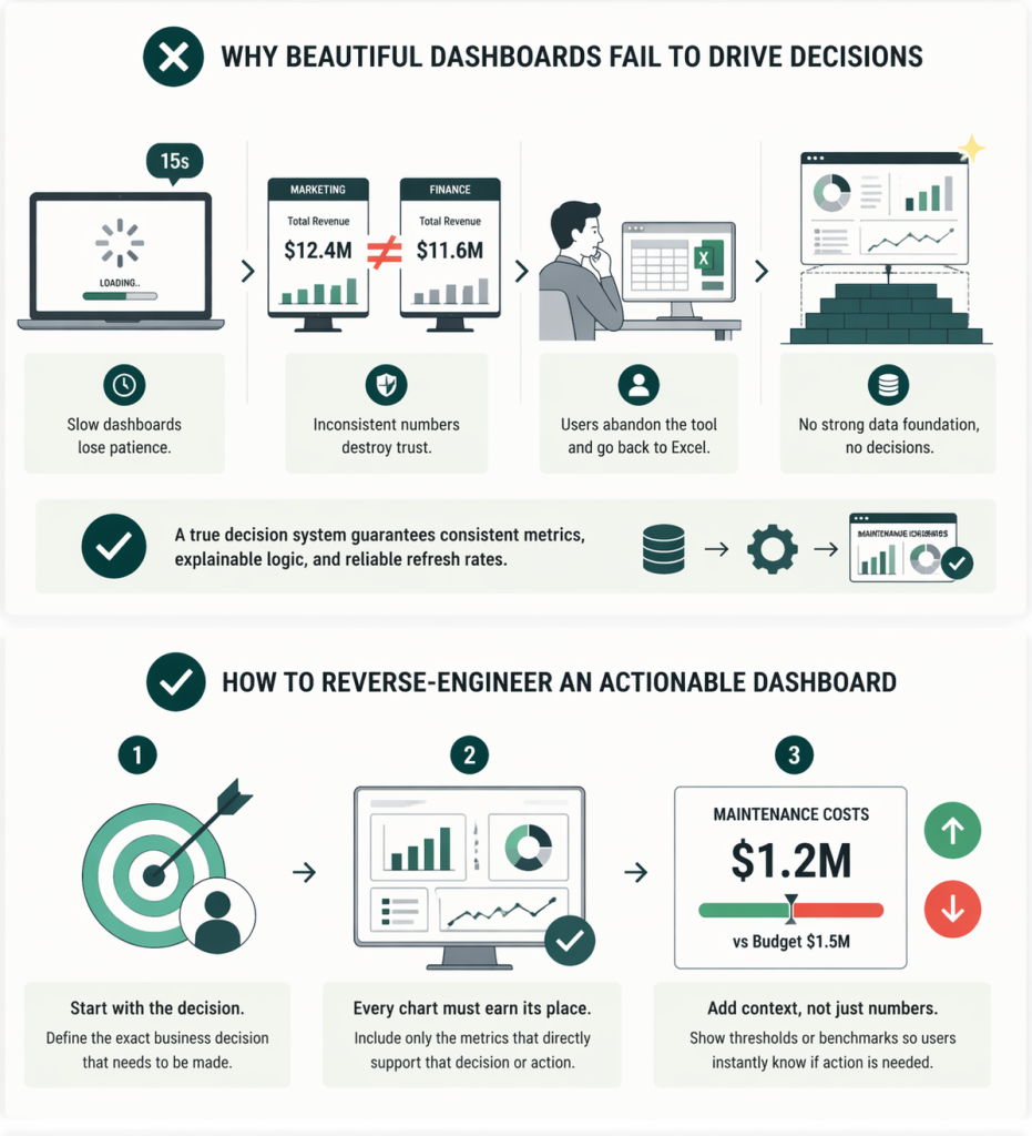
How Do You Reverse-Engineer an Actionable Dashboard?
You reverse-engineer an actionable dashboard by defining the exact business decision that needs to be made first, rather than starting with a list of available data points.
If the goal is to “Allocate Production Capacity,” what exact metrics does the plant manager need to make that call? Every chart on the screen must earn its place by supporting that specific action.
Furthermore, you must embed context. A number on a screen is useless without a threshold. Do not just display “1.2M Maintenance Costs”. Display “1.2M Maintenance Costs” with a red or green indicator showing how it compares to the $1.5M budget or the historical average. This tells the user immediately if they need to intervene.
Our Data Consulting Services You Might Find Interesting


Can You Integrate Power BI Directly With Operational Workflows?
Yes, a true decision system allows users to take immediate action without leaving the dashboard by integrating automation tools like Power Automate.
A dashboard should not be a dead end. If a supply chain manager looks at a Power BI report and sees that inventory for a key component has dropped below the safety threshold, they usually have to open their ERP system, find the part, and order it.
With modern Power BI architecture, we embed buttons directly into the report. The manager clicks “Reorder,” and Power Automate instantly triggers the workflow in the ERP and sends a notification to the procurement team in Microsoft Teams. This turns passive observation into immediate execution.
Stop Building Visuals. Start Architecting Decisions.
Performance, trust, and actionability are not design choices; they are architectural choices. If your business users do not trust the data or find the reports too slow to use, the solution is not a new chart type. The solution is a better data foundation.
At Multishoring, we specialize in Modern Data Architecture and Power BI Consulting. We help companies move away from self-service chaos. Our experts design the semantic models, set up the governance frameworks, and build the automated decision systems that turn your data into a competitive advantage.