
Content

Finance teams must stop delivering plain spreadsheets and start delivering actionable insights. Executives do not want to hunt for answers in a 50-slide deck of profit and loss statements. They need a clear narrative that explains what happened, why it happened, and what the business should do next.
Financial data storytelling bridges the gap between raw numbers and strategic decisions. When you present monthly financial results or budget variances to the board, the goal is not just to share data. The goal is to drive action.
If your stakeholders struggle to understand finance reports, the problem is rarely the data itself. It is the delivery. This guide explains how to structure a finance presentation, turn complex dashboards into simple narratives, and present financial KPIs that persuade leadership.
What is Financial Data Storytelling vs. Standard Reporting?
Financial reporting delivers the numbers. Financial data storytelling delivers the “so what.” While a standard report shows a 15% drop in net revenue, a data story explains that higher customer churn in the enterprise segment caused the drop and outlines a plan to fix it.
Finance professionals spend hours building intricate Excel models and Power BI dashboards. Yet, these presentations often fail to persuade stakeholders. Executives ignore finance reports when they are overwhelmed by rows of raw data without a clear narrative. They do not want to analyze a spreadsheet during a board meeting. They want you to summarize financial performance and provide actionable recommendations.
The difference between dashboarding and storytelling comes down to context. Dashboards require the user to find the insights. Storytelling guides the user directly to the insights.
Finance Reporting vs. Finance Storytelling
| Feature | Standard Financial Reporting | Financial Data Storytelling |
|---|---|---|
| Core Question | What happened this month? | Why did it happen and what is next? |
| Output | Spreadsheets, raw data, heavy tables | Clean visuals, bold headlines, clear narratives |
| Audience | Accounting and finance teams | Non-financial stakeholders, executives, the board |
| Goal | Accuracy and compliance | Persuasion and strategic action |
Why do financial dashboards fail?
They fail because they present point-in-time metrics without a storyline. When presenting financial KPIs to the board, you must learn how to explain complex financial data to non-financial stakeholders. A wall of numbers creates confusion, while a focused narrative creates clarity.
When should finance use storytelling instead of detailed reporting? Use detailed reporting for month-end close, compliance, and audit trails. Switch to data storytelling for FP&A presentations, rolling forecasts, and any executive meeting where leadership must make strategic choices based on budget vs actual analysis.
Struggling with finance reports?
We provide comprehensive data visualization and storytelling services. Let our experts help you transform complex financial numbers into clear, actionable business narratives.
Let us guide you through our data visualization and storytelling process.

Let us guide you through our data visualization and storytelling process.
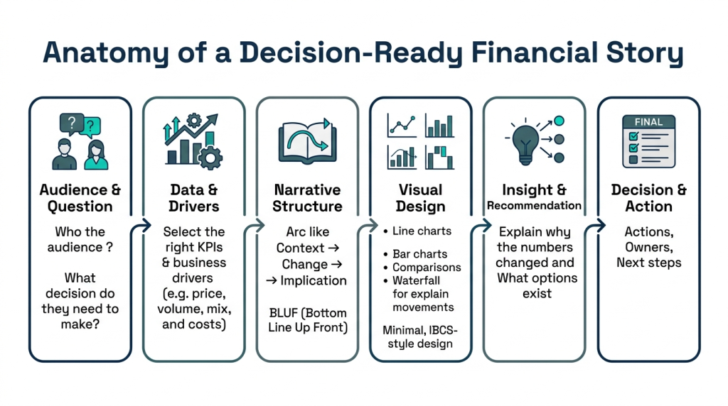
How to Build a Finance Story from Raw Data
Start your presentation with the conclusion. Executives do not have the time to follow your analytical journey from raw data to final insight. Give them the bottom line up front, then use your data to back it up.
Building a compelling narrative requires a shift in how you structure a finance presentation. You must move away from simply pasting Excel tables into PowerPoint. Instead, follow a structured financial storytelling framework to turn numbers into action.
Step 1: Define the Business Question
Every good story answers a specific question. Before opening Power BI or Excel, ask yourself what the audience needs to know. Are you explaining a revenue shortfall in a board presentation, or are you showing cost inflation impacts to operations leaders? Tailor your focus to the exact problem your stakeholders are trying to solve.
Step 2: Find the Driver Behind the Variance
Never present budget vs actual numbers without explaining the gap. If operational expenses are 10% over budget, dig into the raw data to find the root cause. A successful FP&A presentation highlights the specific drivers – like a sudden spike in software licensing fees or unexpected overtime costs – rather than just stating the total variance.
Step 3: Structure the Finance Narrative
A persuasive financial story follows a clear three-part arc:
- Context: What is the current situation? (e.g., Q3 revenue missed the forecast by $2M).
- Insight: Why did it happen? (e.g., A key product launch was delayed, pushing sales into Q4).
- Action: What is the recommendation? (e.g., Adjust Q4 sales targets and freeze non-essential hiring until November).
Step 4: Write Actionable Headlines
Slide titles should tell the story. Do not use generic titles like “Q3 Revenue vs Budget.” Instead, write commentary for executive financial dashboards directly into the header. Use titles like “Q3 Revenue Missed Budget by 5% Due to Delayed Product Launch.” If the stakeholder only reads your headers, they should still understand the full story.
By focusing the narrative on the drivers and the outcomes, you stop overwhelming executives with data dumps. You replace confusion with clarity, making it much easier to communicate forecast changes to stakeholders and secure their buy-in.
Our Data Consulting Services You Might Find Interesting

Data Warehouse Consulting Services
We design, build, and modernize data warehouses that bring order to your fragmented data.

Modern Data Architecture Services
We design and implement data architectures that replace aging legacy systems with a scalable cloud foundation.

Data Governance Consulting & Integration
We help you build a practical system of trust around your information. We work with you to make sure your data is accurate.
Choosing the Best Charts for Financial Storytelling
The right chart makes your insight instantly clear, while the wrong chart buries your message. When choosing charts for financial storytelling, prioritize simplicity over complexity. Do not force your executives to decode a chaotic, cluttered graph.
Finance data visualization vs data storytelling is a critical distinction to understand. Visualization is simply the graphic on the screen. Storytelling is how that graphic connects to your headline, provides context, and drives a business decision. Why chart choice matters in finance presentations comes down to cognitive load. You want stakeholders thinking about the business problem, not trying to decipher your axes.
How to Present Variance Analysis Visually
Variance analysis is the backbone of FP&A reporting. When you need to present budget vs actual numbers or explain a revenue decline with charts, skip the standard clustered bar charts. Use a waterfall chart instead.
Waterfall charts are the best way to explain forecast variance to non-financial audiences. They clearly visualize the starting budget, the specific positive and negative drivers that impacted the period, and the final actual number. This makes it incredibly easy to explain cash flow drivers visually or show exactly which product lines missed their targets.
How to Present Financial Trends to the Board
When tracking operational finance metrics or presenting monthly financial results, rely on clean, familiar formats. The goal is to show financial trends without overwhelming executives.
- Line charts: Use these to display profitability trends or margin changes over many months. Remove unnecessary gridlines to keep the focus on the trendline.
- Horizontal bar charts: These are highly effective for ranking items. Use them to present margin trends by product line or to show top overhead expenses from highest to lowest.
- Bar and line combos: Use these carefully. Mixing a bar chart for total revenue and a line chart for gross margin percentage works well. Adding a third metric usually creates confusion.
What charts work best for financial storytelling? The ones that require zero explanation. If you have to spend two minutes explaining how to read the visual during a leadership meeting, you have chosen the wrong format. Always pair your clean charts with narrative commentary to guide the reader directly to the core insight.
Best Tools and Templates for Finance Storytelling
Stop wasting days manually updating spreadsheets. The best tools for financial data storytelling automate your data pipelines so you can focus on writing the narrative. Choosing the right financial dashboard software for executives depends on your team’s technical skills and how leadership prefers to consume insights.
The debate often centers around Excel vs Power BI for financial storytelling. Excel offers total control, while modern BI platforms offer automation. Below is a breakdown of the best reporting software to help you turn raw data into a compelling executive narrative.
Evaluating Finance Storytelling Software
| Tool Category | Best Use Case | Strengths | Storytelling Capability |
|---|---|---|---|
| Excel & PowerPoint | Ad-hoc analysis and custom finance presentation templates for executives. | Ultimate flexibility. Every finance professional knows the exact formulas. | Requires manual formatting to tell a good story. Dashboards break easily and lack dynamic drill-downs. |
| Power BI | Automated monthly financial reporting and interactive board dashboards. | Deep data integration. Power BI for finance storytelling shines when using automated waterfall charts. | Highly capable. Features like “Smart Narrative” automatically generate text summaries of your visuals. |
| Looker & Tableau | Enterprise-wide deployment and self-serve executive analytics. | Excellent at handling massive datasets. Looker for finance dashboards handles complex operational data well. | Requires heavy initial setup. Finance teams often need IT support to build the initial data models. |
| AI & Specialized FP&A | Automated commentary for financial reporting and variance analysis. | Built specifically for finance workflows. Tools like Zebra BI plug directly into existing BI stacks. | The strongest out-of-the-box narrative. AI tools for financial storytelling automatically detect and explain variance drivers. |
If you want immediate results without buying new software, standardize your slides first. A clean board reporting template finance teams can reuse saves hours of repetitive formatting.
A highly effective executive finance summary template only needs three elements per slide. It needs a clear headline that states the main insight, a single clean chart proving the point, and a short bulleted list of recommended actions. Do not clutter the template with data tables. Keep the focus entirely on the business decision at hand.
Summary and Next Steps
Financial data storytelling is the fundamental difference between a report that gets ignored and a presentation that drives action. When you present financial KPIs to the board, your goal is to clarify the path forward, not just recite the past. By shifting away from dense spreadsheets and adopting a structured financial storytelling framework, you empower leadership to make strategic decisions with confidence.
The most successful finance leaders simplify complex financial data by leading with the bottom line up front. They replace cluttered tables with clean, focused visuals like waterfall charts to explain budget variance clearly. Every slide in an executive finance presentation must answer the “why” behind the numbers, pairing an actionable headline with precise narrative commentary.
Start improving your board reporting today by standardizing how you deliver insights. Secure a reliable finance presentation template for executives, upskill your FP&A analysts with financial storytelling training, and leverage BI tools like Power BI to automate the heavy lifting. When your finance team spends less time formatting rows of data and more time crafting the narrative, they transform from number-crunchers into indispensable strategic partners.