
Content

Chasing top-line revenue is a common trap. When sales numbers climb month over month, leadership naturally assumes the company is doing well. However, revenue only tells half the story. If a top-selling software tier demands expensive cloud compute resources, or a flagship client requires constant custom engineering, those sales might actually be losing you money.
To understand the true health of a B2B or IT services business, finance teams must look past the initial invoice. They need to measure fully loaded gross and net margins at the product and individual customer levels.
By using Power BI, modern financial controllers shift the conversation from a generic “What is our total margin?” to a highly specific “Which exact customers and products are dragging down our margins, and why?”
Why High Revenue Does Not Mean High Profit?
Sales volume often hides the heavy operational costs required to service demanding accounts. A client bringing in $100,000 in Annual Recurring Revenue (ARR) looks like a massive win on a sales leaderboard. But if serving that client requires heavy discounting, daily support tickets, and dedicated project managers, their net margin might fall below zero. You are effectively paying them to use your service.
Industry Benchmarks for IT and SaaS Margins
Context matters when evaluating these numbers. In the B2B technology space, a healthy net profit margin generally sits between 10% and 20%. When we look at gross margins, the expectations shift based on the product type.
- Enterprise SaaS: Typically targets 80–85% gross margins.
- Mid-Market to SMB SaaS: Ranges between 72–78%.
- AI-Native or Managed Services: Often see lower gross margins (55–70%) due to high third-party compute and infrastructure costs.
If your standard reporting tools only look at total revenue minus basic licensing costs, you will fail to see when specific products fall wildly outside these industry benchmarks.
How to Combine Revenue and Cost Data in Power BI?
To calculate true margins, you must unify your billing software, project management tools, and cloud consumption logs into a single data model. Spreadsheets cannot handle this complexity because costs and revenues live in entirely different databases on different timelines.
Matching Costs to Specific Clients
A proper Power BI margin model requires blending specific data sets. First, you pull Monthly Recurring Revenue (MRR), contract values, and applied discounts from the CRM or billing system. Next, you allocate the Cost of Goods Sold (COGS). For technology firms, this means matching contractor hours, AWS/Azure infrastructure costs, and third-party API fees directly to the client that consumed them.
Finally, operating expenses—like customer success manager (CSM) time and marketing allocations—are factored in to calculate the true net margin.
Handling Changing Costs Over Time
Costs fluctuate constantly. The price of server hosting or hourly contractor rates changes over the course of a year. A major advantage of building this in Power BI is the use of dynamic cost history tables.
Instead of subtracting today’s cost from yesterday’s sale, the data model correctly matches the transaction date to the exact cost structure that existed at that specific moment, providing complete historical accuracy.
Do you know which clients are actually losing you money?
We build data models that combine your billing, support, and delivery costs to reveal the true profitability of every product and customer in your portfolio.
Stop chasing bad revenue.

Stop chasing bad revenue.
Using Visuals to Find Profitable and Unprofitable Products
A spreadsheet hides data in endless rows and columns, but specific Power BI visuals show you exactly which products make or lose money at a glance. Power BI offers specialized formats to digest complex profitability data instantly.
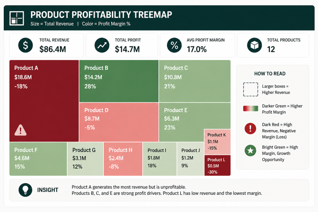
Finding Patterns with Treemaps
A Treemap is highly effective for product portfolio analysis. It displays your categories as nested rectangles. The size of the rectangle represents total revenue, while the color intensity represents the profit margin.
A CFO can look at the screen and immediately spot the reality: a massive, dark red box indicates a product generating millions in revenue but operating at a severe loss. Conversely, a small, bright green box highlights a highly profitable niche that deserves more sales focus.
Comparing Growth Against Profitability
Another analytical view involves plotting customers on a scatter chart, with MRR growth on one axis and Gross Margin percentage on the other. This creates four distinct quadrants. It clearly separates the high-growth/high-margin accounts from the low-growth/low-margin accounts that either need immediate renegotiation or should be allowed to churn.
Tracking Hidden Costs – Cloud Usage and Customer Support
Profit erosion in the technology sector usually stems from three distinct areas: infrastructure waste, over-servicing, and deep discounting. Power BI helps you track these hidden costs directly.
Tracking Cloud and AI Costs
New features, especially those utilizing artificial intelligence, require massive processing power. If an AI-heavy product tier is sold without usage limits, heavy activity from a few clients can destroy the product’s gross margin. Power BI tracks these specific compute costs per account, allowing you to adjust pricing tiers before the cloud bill gets out of hand.
Measuring the Cost of Customer Support
Not all revenue is equal. Some clients integrate seamlessly, while others generate dozens of support tickets and require constant onboarding help. By feeding helpdesk ticket data into the Power BI model, you can map support hours against account revenue. This reveals which customers are draining your delivery resources.
Our Data Consulting Services You Might Find Interesting

Data Warehouse Consulting Services
We design, build, and modernize data warehouses that bring order to your fragmented data.

Modern Data Architecture Services
We design and implement data architectures that replace aging legacy systems with a scalable cloud foundation.

Data Governance Consulting & Integration
We help you build a practical system of trust around your information. We work with you to make sure your data is accurate.
How To Calculate Margin Percentages Without Data Errors?
Hard-coded spreadsheet formulas break when data is missing or formats change. When dealing with millions of rows of financial data, you need stable math that does not crash the report.
In Power BI, developers use Data Analysis Expressions (DAX) to build measures. For example, calculating a margin percentage is basic division: Profit Amount divided by Revenue. However, if you offer a product as a free trial, the revenue is zero. In Excel, this results in a #DIV/0! error that breaks the entire page. In Power BI, we use the DIVIDE function. This handles zero-revenue edge cases gracefully, keeping executive scorecards functioning smoothly regardless of data anomalies.
How Multishoring Helps You Analyze Profit Margins
You cannot fix profitability issues if you cannot see them. Moving from generic revenue tracking to deep, cohort-level margin analysis requires serious data engineering and financial understanding.
At Multishoring, we connect your disparate operational and billing systems into a unified architecture. Through our Power BI consulting services, we build the underlying cost allocation models and design the executive scorecards—like Treemaps and variance dashboards—that show exactly where your money is going. We help you stop chasing bad revenue and start optimizing for actual profit.


