
Content

Most Power BI KPI dashboards fail quietly. They get built, demoed once, and then nobody opens them on a Monday morning. The ones that last share a single trait: every number on the screen is tied to a decision someone actually has to make.
A KPI dashboard pulls your key performance indicators into one view – the current result, the target, and the direction of travel – so leaders can see where the business stands without waiting for a report. The hard part is not the software. It is deciding what belongs on the screen and designing it so the answer is obvious in seconds. This guide is written for executives and the teams who build for them.
Most Power BI KPI dashboards fail quietly. They get built, demoed once, and then nobody opens them on a Monday morning. The ones that last …
What a Power BI KPI Dashboard Actually Is
A Key Performance Indicator (KPI) is a measurable value that shows how close you are to a goal. In Power BI, a KPI is not just a number – it pairs a current result with a target and, usually, a trend, so you can tell at a glance whether things are moving the right way.
A Power BI KPI dashboard is a single page that brings several of these indicators together for one audience and one purpose: a CFO’s monthly view, a sales leader’s pipeline check, an operations team’s daily snapshot. The audience decides what goes on it.
KPI Visual vs. KPI Card vs. KPI Dashboard
These three terms get used interchangeably, which is where a lot of confusion starts. They are not the same thing:
- The KPI visual is Power BI’s built-in object for one indicator. It shows a value, a goal, and a trend line in a single tile, with color cues when you are above or below target.
- A KPI card (the Card visual) shows one number with full formatting control – custom DAX, dynamic titles, conditional color. Teams reach for it when the built-in KPI visual feels too rigid.
- A KPI dashboard is the whole page: several KPI visuals or cards arranged so the story reads top to bottom.
Picking the right building block matters. The built-in KPI visual is quickest when you have a clean target and a date field. The Card gives you more control when the calculation is unusual or you want a specific look – our guide to Power BI data visualization covers those options. A Gauge works for progress toward a fixed goal with no time series, such as daily capacity used. Microsoft’s documentation on the KPI visual walks through the measures each one needs.
Need Expert Help With Your Power BI Dashboard?
Our team specializes in enterprise Power BI consulting – from building KPI dashboards and optimizing data models to fixing refresh issues and improving report speed.
See how our experts can strengthen your Power BI setup and deliver actionable KPIs.

See how our experts can strengthen your Power BI setup and deliver actionable KPIs.
What Makes a KPI Dashboard Decision-Ready
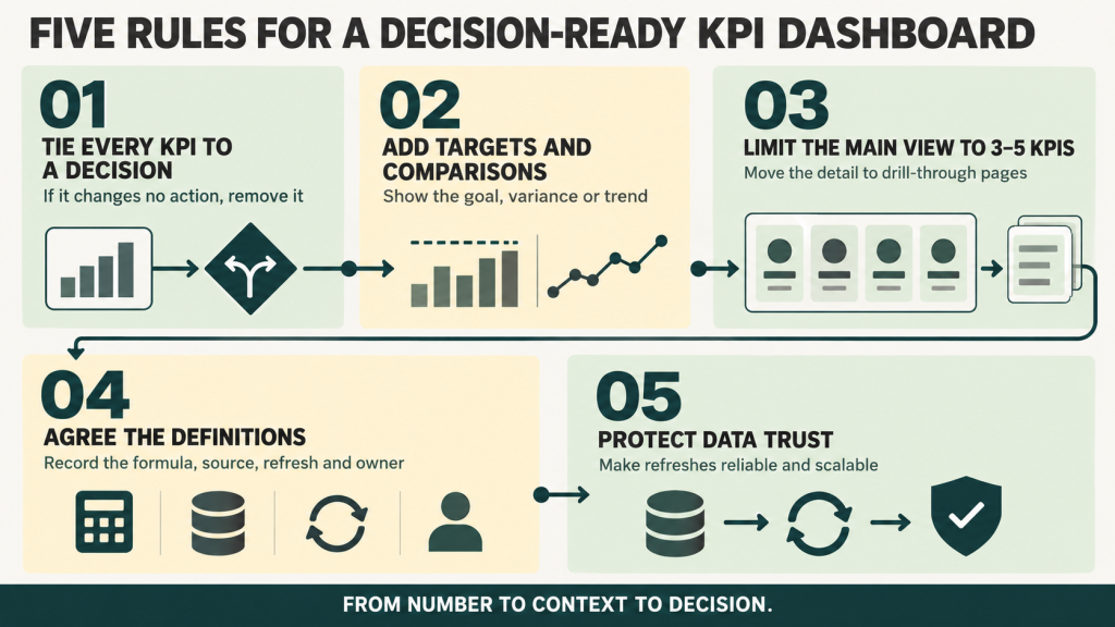
The difference between a dashboard that drives decisions and one that collects dust is rarely the visuals. It is whether the numbers are chosen well and framed with enough context to act on. Five habits separate the two.
Tie Every KPI to a Decision
Start from the question a leader is trying to answer – are we going to hit the quarter, is churn getting worse, can we fund the next hire – and work back to the one or two metrics that answer it. A number that does not change anyone’s next move does not belong on the page. Choosing that set is its own discipline; our guide to business intelligence KPI metrics goes deep on which ones matter by role.
Give Every Number a Target and a Comparison
“$8M in revenue” means nothing on its own. Show variance from goal, last year’s figure, or a rolling average so the viewer knows instantly whether the number is good or bad. A KPI without context is just trivia on a screen.
Keep the Main View to 3-5 KPIs
A crowded page hides the signal. Put the health-check metrics on one screen and push everything else to drill-through pages or tooltips. If a leader has to scroll or hunt, the dashboard has already lost them.
Agree on Definitions Before You Publish
In a large organization, “net revenue” or “active customer” can mean three different things across three departments. A short KPI dictionary – formula, data source, refresh schedule, and the owner responsible for accuracy – keeps the numbers audit-ready and prevents the arguments that quietly kill trust in a dashboard.
Make Sure the Data Holds Up
A KPI that needs manual cleanup every month will fall out of use. Confirm each one refreshes reliably and scales to enterprise volumes before it goes on an executive’s screen. The visual is only as credible as the pipeline behind it.
Designing a Dashboard Executives Actually Use
Executives read a dashboard the way they read a page – top-left first, then down. Design with that in mind and the page explains itself. A few choices do most of the work:
- Lead with the headline metrics. Put the three to five numbers that matter in the top row or upper-left, sized larger than everything else.
- Treat color as a signal rather than decoration. One scheme, green for on track and red for behind, used the same way on every visual so nobody has to relearn the page.
- Write titles that state the insight. “Sales up 7% vs. last year” tells a reader more than “Sales.”
- Keep the palette, fonts, and labels consistent across every departmental dashboard. That consistency supports one version of the truth and speeds up adoption.
For the full design playbook – layout grids, visual hierarchy, and interaction patterns – see our Power BI dashboard design guide.
Where KPI Dashboards Go Wrong
Most failed dashboards share a handful of causes. Knowing them upfront saves a rebuild:
- Vanity metrics crowd out the useful ones. Total page views or cumulative sign-ups look impressive and tell a leader nothing about what to do next. Our take on executive dashboards that work digs into this.
- A KPI with no target is just a number. Viewers can’t tell success from failure, so they stop looking.
- When the refresh lags or breaks, people lose trust fast and drift back to spreadsheets.
- Ten overlapping dashboards are worse than three clear ones. Review them on a schedule and retire what no longer maps to strategy.
Summary and Key Takeaways
A Power BI KPI dashboard is worth building when it shortens the path from number to decision. The tooling is the easy part; the value comes from the choices around it.
- Choose KPIs from decisions, not from whatever data is easiest to pull. Three to five metrics that each change a next move, with definitions written down.
- Frame every number with a target, a variance, or a trend. Never a figure on its own.
- Design for a single glance: headline metrics first, consistent color and labels, detail pushed to drill-through.
- Protect trust with reliable refreshes, agreed definitions, and a regular review to clear out what no longer matters.
Get those right and the dashboard stops being a report. It becomes the place leaders go to decide what happens next. For step-by-step setup, Microsoft’s official KPI documentation and DataCamp’s Power BI KPI tutorial both walk through the build in detail.
Frequently Asked Questions
What is a KPI dashboard?
A KPI dashboard is a single screen that tracks a small set of key performance indicators against their targets. In Power BI, it combines KPI visuals, cards, or gauges so leaders can see current results, goals, and trends in one place and act without pulling a separate report.
What is a KPI in Power BI?
A KPI (Key Performance Indicator) in Power BI is a measurable value that tracks progress toward a specific business goal. It usually combines a current value, a target, and a trend over time to show whether performance is improving or declining.
How do I create a KPI dashboard in Power BI?
Start with a clean data model that includes your actual measures, target measures, and a date field. Add KPI visuals or cards for each headline metric, set the targets and conditional colors, then arrange the three to five most important on one screen with detail on drill-through pages. Microsoft’s KPI visual guide covers the field setup step by step.
Can I use a Card or Gauge visual instead of the KPI visual?
Yes. Card visuals are useful for displaying a single number with custom formatting or DAX calculations, while Gauge visuals show progress toward a target as a dial and don’t need a time series. Many dashboards combine all three for more flexibility.
How many KPIs should a Power BI dashboard include?
For an executive dashboard, aim for 3-5 key KPIs on the main screen. Additional supporting metrics can live on drill-through pages or secondary tabs, so the main view stays clear while the detail is a click away.
What makes a KPI dashboard effective for executives?
An effective dashboard is focused, consistent, and readable at a glance. It shows only the KPIs that drive decisions, uses clear visual cues such as color and trend lines, and gives every number context through variance from target or historical comparison.


